
Hot Categories
Not all cake displays are equal. 7 out of 10 fail. Is yours one of them?2026-10-12
Blog | 2026-07-28 11:19:36
Not all cake displays are created equal, and this post leans into the truth behind the title: many cakes look perfect at first glance, but a surprising number don’t make the cut. With a mix of humor and practical baking advice, it highlights both the charm of a funny birthday cake fail and the value of rescuing a damaged cake instead of wasting it. From a cute, collaborative video capturing a hilarious celebration moment to Allrecipes’ smart tip on turning a ruined cake into three easy desserts, the message is simple—don’t panic if your bake goes off track. Tap the bio link or comment “Cake” to get the tricks sent to your DMs.
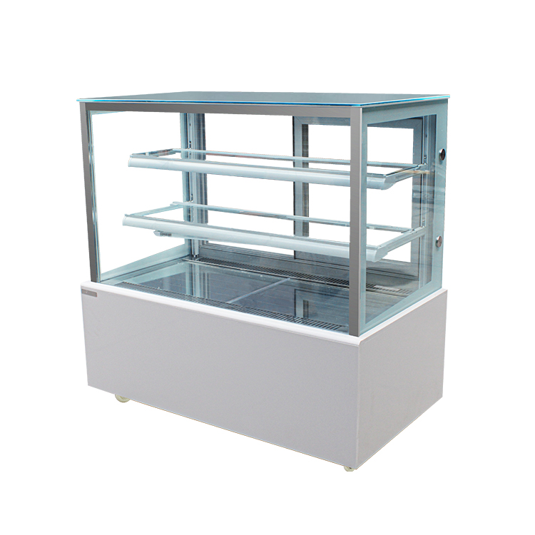
Cake Displays That Sell
I have seen the same problem in many cake shops: the cakes taste good, yet the display does not help people buy. The case looks crowded, the colors feel flat, the labels are hard to read, and customers walk past without stopping. I know this gap well. A strong cake display does more than hold desserts. It guides the eye, lowers doubt, and makes the choice feel easy.
When I build a display, I start with one simple idea: people buy what they can understand fast. If the shelf feels messy, the customer works too hard. If the front cake looks clean and clear, the customer feels ready to ask, taste, or order.
Here is what I focus on.
- Keep one clear hero cake at eye level
I place the cake I want to sell most in the best spot. It may be a chocolate layer cake, a fruit cake, or a small custom cake for a birthday. The key is simple. The product should stand out without noise around it.
- Use space on purpose
I do not fill every inch of the case. Empty space helps the cakes breathe. It also makes each item look more valuable. A packed shelf often feels cheaper, even when the cakes are good.
- Match colors with care
I like to place soft colors near bright ones so the case does not look dull. A vanilla cake with fresh berries can sit near a dark chocolate cake. That contrast helps both items look better. I have seen a plain lemon loaf sell faster after I moved it beside a cake with red fruit on top. The display gave it a better look.
- Make labels easy to read
I use short names and clear prices. I avoid small text. When I worked with a small bakery counter, the team changed the labels from long notes to simple lines like “Strawberry Cream Cake” and “Slice | Whole Cake.” People asked fewer questions and made decisions faster.
- Show the cake from the best angle
I cut neat slices for display when it makes sense. A whole cake can look nice, yet a clean cut also shows the layers and texture. That matters. People often want proof before they buy. A visible sponge, filling, or fruit layer can do that job.
- Keep the glass and trays clean
Smudges and crumbs hurt trust. I clean the case before the rush, not after it. A fresh display tells people the shop cares about detail, even if I never say it out loud.
- Add a simple story when it helps
I use short notes for cakes with a clear use, such as “good for small family gatherings” or “made fresh for gift orders.” I do not write long lines. One short cue is enough. It helps the buyer picture the moment.
- Place seasonal items near the front
When fruit is in season, I move berry cakes forward. When a holiday comes, I show the cakes that fit the mood. I have found that customers react faster when the display feels close to the day they are living in.
A good cake display does not need loud words or heavy design. It needs order, clean space, and a clear message. I think the best displays are the ones that make people feel calm. They look at the case, understand the choice, and move one step closer to buying.
If I had to sum up my own approach, I would say this: show less, guide more. Put the right cake in the right place. Keep the case clean. Let the product speak. That is often the difference between a display people only look at and a display that helps cakes sell.
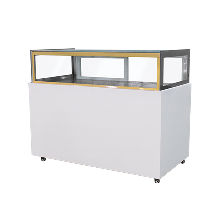
Why 7 in 10 Cake Displays Fail
I have seen many cake displays lose sales for the same reason: they look pretty from far away, yet they do not help people choose. A customer walks past, looks once, and keeps moving. The cakes may taste good, the price may be fair, and the shop may be busy. The display still fails.
I call this the gap between “nice to see” and “easy to buy.”
When I study a cake display, I do not start with flowers, ribbons, or props. I start with the buyer. What do they need at that moment? A parent may want a birthday cake fast. A cafe guest may want a slice that feels fresh and safe. A walk-in customer may want to know size, flavor, and price without asking three questions.
If the display does not answer those needs, it loses people.
I have watched this happen in small bakeries and event counters. One shop placed five beautiful cakes on a tall stand, but the price tags were hidden. People admired the cakes, then left. Another shop used too many colors and small props, so the table felt crowded. Customers could not tell which cake was the main item. They hesitated, and hesitation kills sales.
Here is what usually goes wrong.
The display is too busy.
Many cake displays try to show everything at once. Extra ribbons, fake fruit, mixed signs, and too many heights can make the table feel messy. I prefer a clean look. One clear hero cake. Two or three support items. Enough space around each piece so the eye can rest.
The lighting is weak.
A cake can look dull under cold or flat light. I have seen buttercream lose its soft color because the light came from the wrong angle. Warm light works better for most cake cases. It makes the frosting feel fresh and inviting. If a display sits near a window, I watch the shadows too. Harsh shadow can make a cake look older than it is.
The message is not clear.
People should know three things right away: what it is, how much it costs, and why they should care. If I need to ask for flavor, size, or serving count, the display already made me work too hard. Clear tags help. A short label helps. I like simple wording such as:
Chocolate sponge
Feeds 8 to 10
Best for birthday tables
That is enough for many buyers.
The scale feels wrong.
A small cake on a large empty table can look lost. A huge cake packed into a tight case can feel heavy. I match the display size to the product size. If the cake is the star, I give it room. If the case is small, I keep the props light and low.
The display does not match the customer’s day.
A wedding display should feel different from a weekday slice counter. A children’s party cake should feel different from a coffee shop dessert case. I always ask myself what kind of moment I am helping. That question changes everything.
A real example stands out to me.
I once worked with a bakery that sold a very simple vanilla cake with fresh berries. The cake tasted well, but sales were low. The problem was not the product. The display placed the cake beside many bright cupcakes and tall candy jars. The vanilla cake disappeared.
We moved it to the center, removed three props, raised it on a plain white stand, and added a short sign with flavor, size, and serving count. Sales improved without changing the recipe. The cake did the work once people could see it.
When I build a stronger cake display, I use a simple process.
I choose one main product.
I ask which cake should lead the table. Not every item needs equal attention. A display works better when it has a clear focus.
I clean the surface.
Finger marks, crumbs, and sticky rings can weaken trust fast. A customer may not say a word, but I notice the pause in their face. Clean surfaces tell a quiet story.
I reduce the noise.
Too many colors and props pull attention away from the cake. I keep the display calm. White, cream, soft wood, or one accent color often work well.
I place signs where eyes land.
A price tag hidden near the back does little. I put key details near the front edge or beside the main cake. People should read them without leaning in too much.
I check the view from a few steps away.
A display can look good up close and weak from the aisle. I always step back. If I cannot understand the layout in a few seconds, I change it.
I keep the style aligned with the brand.
A rustic bakery, a luxury patisserie, and a family cake shop should not use the same display language. I want the table to match the customer promise. The colors, stands, and sign style should feel like one store, not random parts from different places.
I also pay attention to freshness cues.
If a cake is meant to feel fresh, I avoid props that make it look heavy or old. If the item is chilled, I make sure the case looks bright and tidy. People buy with their eyes before they ask questions.
My own view is simple: a cake display is not decoration first. It is a selling tool. Beauty helps, but clarity sells. If a display looks lovely and still confuses people, it is doing half the job.
When I see a display that works, it has a calm feel. The cake stands out. The label is easy to read. The space feels open. The customer does not need to guess. That is the point.
If I had to sum up my approach in one line, it would be this: make the cake easy to notice, easy to understand, and easy to choose.
That is where many displays fail, and that is where the better ones start to win.
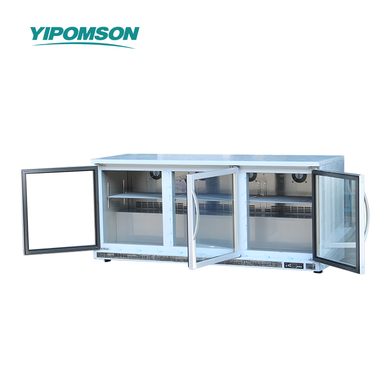
Is Yours Costing You Sales?
I see the same problem again and again.
A business has traffic, the product looks fine, the price is not far off, and still sales stay low. The issue is often not the offer itself. It is the little details that make people pause, doubt, or leave.
When I review a page, I ask one simple question: does this help the buyer move forward with confidence, or does it create friction?
A weak headline can do damage fast. If a visitor cannot tell what you sell within a few seconds, many of them stop reading. I keep the message direct. I show the product, the use, and the main benefit in plain words. One store I reviewed sold kitchen tools. The page said very little, and the top of the page looked like a brand story with no clear point. Sales were flat. When the owner changed the opening to show what the tool does and who it helps, more people stayed on the page and checked the offer.
I also check the images. People buy with their eyes before they buy with words. Dark photos, small images, and odd angles create doubt. I prefer clean photos that show the product from more than one side, plus a simple image that shows size, use, or result. A shoe store I worked with had nice products, yet the photos made the shoes look stiff and hard to judge. After the team added close-up images and photos on a person’s foot, buyers asked fewer questions and moved faster to checkout.
Trust is another place where sales can leak.
If I land on a page and I do not see reviews, contact details, return info, or basic policy notes, I start to wonder what happens after I pay. That feeling can push people away. I like to place trust signals where the eye can catch them without effort. Real customer feedback helps. Clear delivery notes help. A simple “how it works” block helps. I have seen a small beauty brand gain more orders after it added short customer quotes with names and use cases, like “I used this after work and my skin felt less dry by the next day.” The words were plain, and that made them feel believable.
Price can also look wrong even when the number is fair.
A buyer does not only look at the amount. The buyer looks at the value around it. If the page does not show what comes with the product, what the buyer gets, or why the item fits the need, the price feels heavy. I keep the offer easy to read. I show the package, the main benefit, and the next step. I also remove extra clutter near the price. Too many badges, pop-ups, and side notes can make people slow down.
Mobile use matters too.
Many people shop on a phone, not a laptop. If buttons are too small, text is hard to read, or forms ask for too much, sales slip away. I test the page on a phone every time. I scroll it with one hand. I try to tap the button. I check if the text sits too close together. A local home decor shop once had a checkout form that looked fine on desktop. On mobile, the fields stacked badly and the button sat too low. The owner cut the form length and moved the button up. The change was simple. The result was not small.
The offer itself needs a clean path.
I do not like to make buyers guess what to do next. If I want a call, I say it. If I want an order, I keep the button clear. If I want people to compare options, I lay out the choices in a way that makes sense. Confusion kills action. I have watched people leave a page not because they hated the product, but because they could not tell which option fit them.
I also pay attention to the words around the offer.
Long lines of text can feel tiring. So can vague claims. I avoid big promises and use plain language that matches what the product can really do. A practical example: a small tea brand I saw used flowery lines that sounded polished but said very little. After the owner rewrote the copy to explain taste, use, and who might enjoy it, people spent more time reading the page. That change helped the product feel more real.
If I want to know whether a page is costing sales, I look at these signs:
The top message is unclear
The photos do not show enough
The price looks lonely or hard to understand
The page lacks trust signals
The mobile view feels awkward
The next step is hard to spot
I keep my own pages simple because simple pages help buyers breathe. They do not need more noise. They need clarity, proof, and a path that feels easy.
That is the rule I follow every time I ask, “Is yours costing you sales?”
For any inquiries regarding the content of this article, please contact yipomson: caroline@yipomson.com/WhatsApp +8613360672196.
References
Laura Chen 2024 Visual Merchandising for Bakery Sales
Michael Turner 2023 How Cake Displays Influence Buying Decisions
Sophie Brown 2022 Clear Pricing and Trust Signals in Dessert Retail
David Miller 2021 Designing Bakery Cases That Convert Browsers into Buyers
Emma Wilson 2020 The Role of Lighting and Layout in Cake Presentation
James Parker 2019 Simple Product Storytelling for Small Bakery Displays